Overview
My task was to redesign the mobile app to improve the UI and minimize cognitive load, ensuring a more intuitive experience for users. Over a two-month period, I took on multiple roles to develop a comprehensive prototype for a more streamlined app. By conducting an in-depth cognitive and heuristic analysis, creating wireframes, and iterating through prototypes, I was able to deliver a project with new features that Smoothie King aimed to introduce in their updated mobile app, set to launch in early 2024.
After testing the new design, 83% of users reported that the design was simpler and more intuitive. Smoothie King reviewed this project and gave great feedback.
Problem & Project Goals
While the app had served as the mobile ordering hub for quite some time, the design missed a few important points that would make ordering smoothies a simple task.
I needed to simplify the user journey, reduce cognitive load along the way, and provide a cleaner, more digestible UI for users.
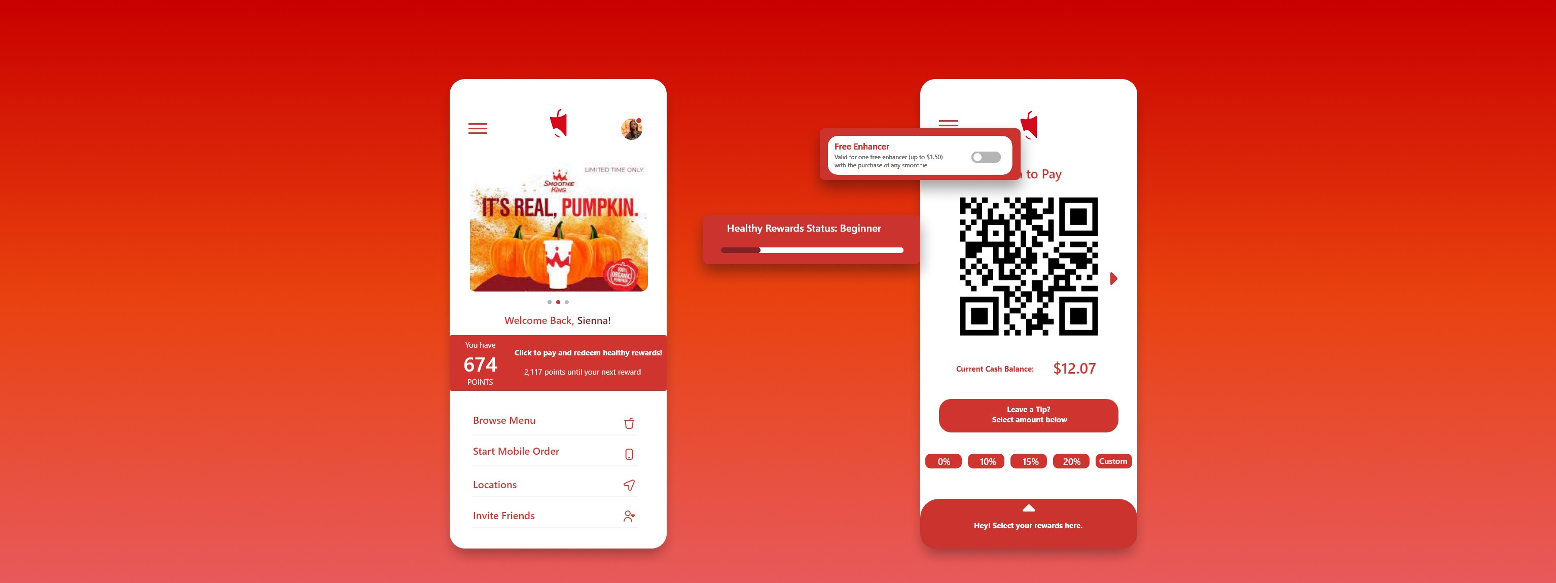
A look at the final screens and widgets for the redesign.
Unique Challenges & Constraints
I was working on a tight deadline. I needed to validate my initial assumptions through user research and testing, but I could only reach a limited number of participants due to availability and other factors.
I was working solo on this project, so I was responsible for all aspects, including outreach, interviewing, ideation, design, and prototyping.
Initial Thoughts & Assumptions
The good thing was that I am an avid Smoothie King goer, and I know my way around the app. I could probably place an order with my eyes closed, but that was because I use it frequently, not because it was user-friendly.
After a quick review of the app, I noticed several issues. To summarize, there was no straightforward path for users to complete a task easily.
Project Beginnings
I mapped out a user's journey when placing a mobile order to identify the various paths users could take. I found that, compared to competitors like Starbucks, there were notable differences in the capabilities available to Smoothie King users when logging into the app.
Miro board featuring the analysis of the app.
What should be a straightforward journey instead involves many detours and obstacles that hurt the user experience.
Initial Testing
I interviewed a diverse pool, some who used the app and some who hadn’t. Each was asked to complete 4 tasks consecutively with no instruction from me.
Findings
All but one participant stumbled when trying to redeem rewards. The tasks were to be completed in succession. So what was the issue? The payment and rewards sections were located in two completely different places. To complete the tasks successfully, users needed to select rewards to redeem before browsing the menu. If they had already selected an item, they would need to exit, return to the homepage, activate their rewards, and then return to the cart. Otherwise, they would miss the opportunity to redeem points or get a free smoothie.
For in-store shoppers, menu browsing wasn’t an issue, but the separation of payment and rewards posed a similar problem. To scan the app for points or redeem a reward, users had to remember to go to the homepage and redeem it first. If they didn’t, they would miss out on a free or discounted smoothie for that day. The QR code scanning options were also confusing, as there were two separate QR codes to scan. One QR code was for redeeming points, while the other was for making payments and there was no clear distinction between them.
These hiccups would quickly become the focus of the redesign, as they heighten the cognitive load for users.
Initial Explorations
When the project began, I intended to focus most of my efforts on the homepage and the slide-over hamburger menu. I was confident there was a lot I could accomplish. I considered designing an interactive map that worked with your location and removing the numerous links in the hamburger menu, consolidating them into just five. Then, I planned to redesign each page to better present the information than it was when spread across ten different links.
However, deadlines proved to be the dream killer. In the end, I didn’t make any changes to the hamburger menu. All of the designs focused on the homepage, so I had to ensure that the decisions I made were impactful.
Narrowed Focus
With the project deadline quickly approaching, I decided to refocus my efforts solely on the tasks that users got hung up on during the initial testing.
I began mapping out different user flows and possible simplified paths.
The goal was now to make the experience upon entering the app simpler and reduce the cognitive load.
START
Select 'redeem healthy rewards
Toggle rewards on or off
Exit rewards page
Select 'scan to pay, earn, & redeem'
Toggle to 'scan to pay'
Scan at register
START
Select 'scan to pay, earn, & redeem'
Toggle to 'scan to pay'
Toggle rewards on or off
Scan at register
Wireframing
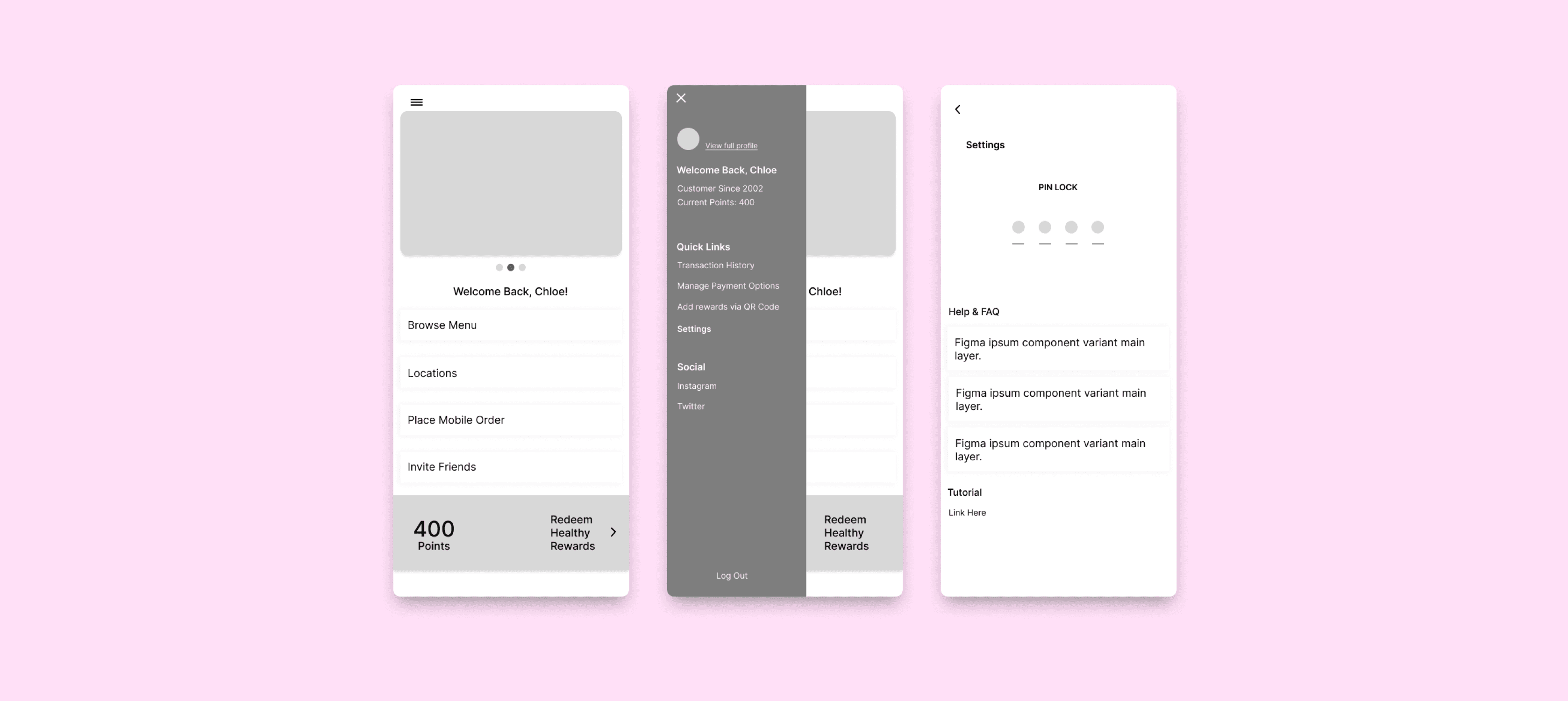
I wasn't looking to completely overhaul Smoothie King's UI, in fact there were hardly any changes to the UI at all. I simply needed the tasks outlined during testing to be make sense.
In order to refine the user experience, I started experimenting with the idea of micro interactions. The goal was not to disrupt the look and feel of the existing interface. How could I do that while also making changes significant enough to shorten the user journey?
Early Design Concept. Wireframes include homepage, extended menu, and settings page consecutively.
Design Decisions
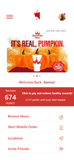
Users can now browse the menu without starting a mobile order.
There are two separate functions: browse menu and start mobile order that live on the home screen.
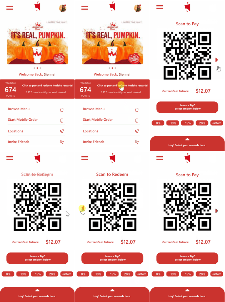
When users go to pay, they are met with a drag option to encourage them to select their rewards before submitting payment
Originally, there was no button to indicate that there was another QR scan option. Adding the button makes that more clear to users.
In the old design redeeming rewards and payments were separate. Now users can simply tap the red banner in the middle of the home screen to access both functions.
Due to scheduling difficulties, I couldn’t test the design on any of the people I initially interviewed. To gauge the new designs, I had to interview a smaller group and test with them as quickly as possible. The new design proved helpful, with roughly 60% of participants reporting better ease of use. However, some users were still confused by the scan options.
Unfortunately, I was unable to make any additional changes before submission, but I believe a 60% success rate is a strong outcome.

